Wednesday, September 16, 2009

Noir (nwär) –adjective French. 1. Of or relating to the film noir genre.

If you remember from my Typography Pt. II: Text Shape Assignment post, I'm not too confident in my graphic design/photoshop skills. Today, I uncovered a long lost flash drive containing my prized design from my Principles of Design class at DePaul University. This is one design that I'm willing to brag about and I am happy I was able to recover it. First, let's find out about the expectations of the assignment.
The Assignment: Noir Poster

1. Choose a game title, film, graphic novel or book that you feel embodies the noir aesthetic. Find or make up a quote that helps sell your subject.
2. Create a poster/ad for your subject.
3. Create a 800x600 image in Photoshop. It can be horizontal or vertical.
4. Use these tools in Photoshop: magic wand (to create the silhouette(s), the gradient tool (including transparency), blur filters, blending modes, layer select (ctrl click the layer), layer effects, distort, and warp.

The Rules:

1. The only visual elements you can (and MUST) use are the title, the quote text, the “author”, and at least one silhouette. You can use multiple silhouettes, but no photos or detailed drawings.
2. The finished image must be black & white, no color.
3. No additional drawing or other created visual elements.
4. You can't create faces, creatures, objects or a landscape, no recognizable images (other than your silhouettes)--concentrate on the visual dynamics.
5. Your Photoshop document should end up with at least 20 layers.

Visual goals:

1. The design should convey mood—suspense, threat, paranoia—but through suggestion, not clichéd images.
2. Create the illusion of depth and light. Use gradients of value, scale, distortion, etc. Does it feel deep? Can you see strong light sources? Are there multiple levels of depth?
3. Keep the text legible, but it should feel integrated into the design. It shouldn’t appear pasted on top of the other elements.
4. Use transparency and shadows to create a sense of disorientation in the shapes and space within the image. Use solidity sparingly. Overlapping, transparency, shadows, perspective, distortion.
5. The poster should be interesting to look at, have visual movement, should be balanced and should seem structured (not random or a mess). Incorporate what we’ve discussed the rest of the quarter.


After receiving these instructions, one movie came to mind immediately -- The Graduate. Not only is The Graduate one of my all time favorite movies, but it certainly captures the noir aesthetic. Here's what I came up with:
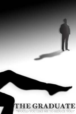
Anyone with a good eye can catch my one mistake -- The shadow of the figure in the background should be dark near the feet and lighter near the head. I'm the first to admit that I'm no deign expert, but regardless of the shadow mistake, I think the poster looks quite nice.
Specifically, I love the way that the shadows are able to convey the illusion of depth. Also, the highlighting on Ben's face creates the illusion that a light source is shining from his left side. It pairs nice with the solid black of Mrs. Robinson's leg in the foreground.
...and who doesn't love that quote?

Saturday, September 12, 2009

Looks Aren't Everything

The average person sees thousands of advertisements a day. As a result, visual aesthetics can be quite important when it comes to making your advertisement stand out amongst the competition. Sight is often considered the most dominant and well-developed sense in humans, so why not appeal to it?

I'm a firm believer that looks aren't everything -- even when it comes to advertising. While visual appeal should not be completely discounted, it can be paired with other complementary components to create a harmonious campaign. Some of my favorite advertisements appealed to an entirely different sense -- the sense of hearing. Let's take a look at my personal top 6...

1. GEICO

I am prepared to get some criticism for this choice, but Geico has created some truly memorable commercials based primarily on their choice of music.


More recently, Geico has been airing their Money with Eyes commercials featuring "Somebody's Watching Me" by Rockwell. Admittedly, I find these commercials to be pretty ridiculous, but there is something catchy about that song.


Equally as outrageous are the Geico Cavemen commercials. The commercial above premiered back in 2006 and the muzak-esque "Remind Me" by Norwegian band Royksopp became an unlikely hit among television viewers.

2. VOLKSWAGON


2000 was two years before my sweet sixteen and this Volkswagon commercial left me utterly convinced that I had to have a VW Cabriolet waiting in my driveway the moment I turned 16. If "Pink Moon" by Nick Drake doesn't evoke a sense of nostalgia, I don't know what does.

3. MOTOROLA


This Motorola RAZR2 commercial is an example of an advertisement that I don't particularly love, but I find it intriguing based on music alone. Shiny Toy Guns' "Le Disko" is a perfect choice to convey the playfulness and sexiness found in the advertisement.

4. APPLE


Appropriately enough, Apple iPod commercials have turned some of the more under-the-radar songs, like CSS's "Music is My Hot, Hot Sex" into instant hits.


The Shadow Dancer campaign is a great example of how to pair exciting visuals with a hot soundtrack. "Technologic" by Daft Punk makes the perfect complement.

5. BACARDI


I get the impression that I was one of the last people to see this commercial, but I vividly remember the first time I did. I was with a group of 20 or so people watching the 2009 All-Star Game when almost everyone (except for me, of course) had a comment or two to make about this Bacardi ad -- "Oh! I love this song." "I don't quite get the ad, but this song is so fun!" "It makes me want a Mojito."

Translation? $$$ -- for both Bacardi and Mike and Kim, whose song "Daylight" is played during this one minute commercial spot.

6. WHERE THE WILD THINGS ARE


Where the Wild Things Are has done an exceptional job at pairing visuals, music and message to create a strong and compelling campaign for this upcoming film. Arcade Fire's "Wake Up" does just what the title of the song suggests. This song woke me from my comatose state of television watching and made me both aware and interested in this movie trailer.


As mentioned above, Where the Wild Things Are succeeds in pulling message into the campaign equation. In this instance, Where the Wild Things Are has paired up with the U.S. Department of Health and Human Services to create a PSA that poses the question: "Did you play today?" Not only is this cause highly relevant to the story line of the film, but those clever advertising folks pull in one more musical hit -- "All is Love" by artist Karen O and the Kids.

Saturday, September 5, 2009

Sex Sells...Coffee?


Today, as I was enjoying my almost-daily Starbucks chai tea latte it caught my attention that lady Starbucks was looking quite a bit sexier these days. It looks as though the Starbucks Siren has undergone a makeover. Gone are the days of black and white frumpiness from a logo that is easily recognizable around the world.

Starbucks' launch of their Anniversary Blend campaign included a re-branding of their cups, coffee bean packaging and other memorabilia items. These items include a more youthful, slimmer and sexier version of the Starbucks Siren as seen in the photos below.


I personally really like this new logo and the strategically placed strands of hair crack me up as well. This new design is fresh and modern -- much like the Starbucks' brand itself. I am curious to see if this new version of the logo will extend beyond the Anniversary blend to eventually replace the classic black, white and green logo. As you can see from the photo of the bags of coffee above, Starbucks is featuring this new design in conjunction with the classical version of the logo.

I hope this new design sticks. The new Starbucks lady is a babe and I think she will do well for the company. I'm also not afraid to admit that I'm slightly jealous of her beautiful hair...

Friday, September 4, 2009

"When In Doubt, Squirrel It Out"

I'll be perfectly honest, I don't quite know what that phrase means, but a colorful character in Las Vegas gave me that piece of advice about a year ago. Apparently, this guy has passed that information on to popular culture as well -- or maybe we should blame this little guy:


He has many names -- the Banff Squirrel, the photo crasher squirrel, the list goes on. Regardless of what you choose to call him, this guy has made it big. The Banff Squirrel is taking over the world of social media with pages on Twitter, Facebook and Wikipedia. Lexi, my beloved childhood dog must be rolling in her grave right about now.

Sites like The Squirrelizer and Twibbon allow you to make any photo a squirrel-crashed photo. Twibbon goes one step farther to automatically update that image as your Twitter profile photo. Take a look:


I think I'll stick to my Cardinals Twibbon, thank you very much!

Squirrel fever has also rubbed off on American Airlines. A recent article from AdFreak discusses American Airlines decision to re-air their Spring campaign which features a Parisian squirrel riding a bike/scooter.


This television commercial spot is a little strange and quirky, but American Airlines really seems to be embracing squirrel-mania thanks to the Banff Squirrel. In the News Releases section of the American Airlines website you can find a press release entitled American Launches Investigation of Possible 'Scene Stealing Squirrel' Role in Recent Television Ad. In this news release, American Airline announces their investigation to determine if the Banff Squirrel is in fact the same squirrel using in the filming of their commercial. The press release goes on to make ridiculous claims like:

“We’re not sure of the actual nationality of said squirrel - not sure whether he’s French at all. We hired him through his agent in LA,” said Bill Oakley, Executive Creative Director with TM Advertising. “Since he popped up in Banff, maybe he’s Canadian.”

Hey, who says airlines can't have a little fun sometimes?

So folks, when it comes to Twitter photos, advertising or life in general, just remember one thing -- when in doubt, squirrel it out...

UPDATE:
CNN Covers the Banff Squirrel on 9/9/09 -- Web Goes Nuts for 'Crasher Squirrel'