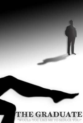
If you remember from my Typography Pt. II: Text Shape Assignment post, I'm not too confident in my graphic design/photoshop skills. Today, I uncovered a long lost flash drive containing my prized design from my Principles of Design class at DePaul University. This is one design that I'm willing to brag about and I am happy I was able to recover it. First, let's find out about the expectations of the assignment.
The Assignment: Noir Poster
1. Choose a game title, film, graphic novel or book that you feel embodies the noir aesthetic. Find or make up a quote that helps sell your subject.
2. Create a poster/ad for your subject.
3. Create a 800x600 image in Photoshop. It can be horizontal or vertical.
4. Use these tools in Photoshop: magic wand (to create the silhouette(s), the gradient tool (including transparency), blur filters, blending modes, layer select (ctrl click the layer), layer effects, distort, and warp.
The Rules:
1. The only visual elements you can (and MUST) use are the title, the quote text, the “author”, and at least one silhouette. You can use multiple silhouettes, but no photos or detailed drawings.
2. The finished image must be black & white, no color.
3. No additional drawing or other created visual elements.
4. You can't create faces, creatures, objects or a landscape, no recognizable images (other than your silhouettes)--concentrate on the visual dynamics.
5. Your Photoshop document should end up with at least 20 layers.
Visual goals:
1. The design should convey mood—suspense, threat, paranoia—but through suggestion, not clichéd images.
2. Create the illusion of depth and light. Use gradients of value, scale, distortion, etc. Does it feel deep? Can you see strong light sources? Are there multiple levels of depth?
3. Keep the text legible, but it should feel integrated into the design. It shouldn’t appear pasted on top of the other elements.
4. Use transparency and shadows to create a sense of disorientation in the shapes and space within the image. Use solidity sparingly. Overlapping, transparency, shadows, perspective, distortion.
5. The poster should be interesting to look at, have visual movement, should be balanced and should seem structured (not random or a mess). Incorporate what we’ve discussed the rest of the quarter.
After receiving these instructions, one movie came to mind immediately -- The Graduate. Not only is The Graduate one of my all time favorite movies, but it certainly captures the noir aesthetic. Here's what I came up with:

Anyone with a good eye can catch my one mistake -- The shadow of the figure in the background should be dark near the feet and lighter near the head. I'm the first to admit that I'm no deign expert, but regardless of the shadow mistake, I think the poster looks quite nice.
Specifically, I love the way that the shadows are able to convey the illusion of depth. Also, the highlighting on Ben's face creates the illusion that a light source is shining from his left side. It pairs nice with the solid black of Mrs. Robinson's leg in the foreground.
...and who doesn't love that quote?


No comments:
Post a Comment